How to Incorporate 2018 Colors in Your Designs
Pantone is making 2018 a year of multiple color personalities. Benjamin Moore is giving us Red! And everyone else seems to think there are fifty shades of black as they nuance various forms of it for 2018.
Pantone is a dominant force in the world of color – particularly for graphic designers. They have provided designers and printers thousands of color books showing color variations made from just the right mixture of the four process colors (Cyan, Magenta, Yellow, and Black).
Today, they are color experts keeping a close eye on future trends. According to Leatrice Eisman, executive director of the Pantone Color Institute, metallic colors are becoming more neutral and iridescent colors will continue to be popular.
She also believes bright or intense colors will be in greater demand than pastels in 2018. “Intense colors seem to be a natural application of our intense lifestyles and thought processes these days,” she said.
To make life easier for designers, Pantone has put out a series of color books showing eight different color palettes that combine colors in harmonious and complementary ways.
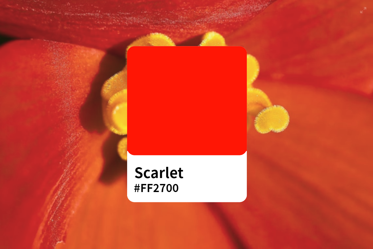
Paint manufacturer Benjamin Moore seems to agree with Pantone on color intensity. Their website shows a combination of 24 colors they believe will be trending in 2018. Among them is a deep red mix.
What does this all mean to you as you design your next marketing piece? Well, using them can give your message a contemporary look – one your readers will consider up-to-date. To use these colors effectively, you need to understand how they work together because the wrong combination will not only send the wrong message, it can make readers uncomfortable. To use them effectively and harmoniously, you need a brief review of color theory.
The Color Wheel
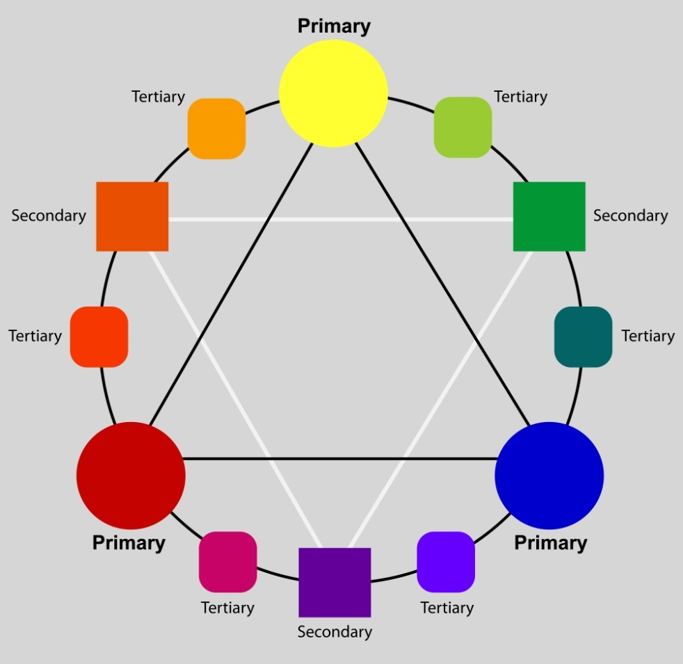
There are three Primary Colors: Red, Blue, and Yellow. All other colors are derived from these three pure colors. If you locate these colors on a circle equally spaced apart, you will form the foundation of a color wheel. If you blend these colors into each other, you will form variations that will transition from one primary color to the next. For example, if you have Yellow at the top of your wheel and Red about a third of the way down, you will form variations of red and yellow. Close to red, you will have a reddish orange. Close to the Yellow, you will have a yellow-ochre. These are Tertiary Colors. In the middle where you have equal parts of Yellow and Red, you have orange, which is a Secondary Color. If you blend Red and Blue, you will achieve various shades of violet on the red side and purple on the blue side. Going from Blue to Yellow will form various shades of green. The color wheel below shows you these variations.
Combining Colors Effectively
One way to achieve Color Harmony is to use a Complimentary Color Scheme. This scheme combines a Primary Color with its opposite Secondary Color on the Color Wheel. For example, the Secondary color Green is the Compliment of Red. The Compliment of Blue would be the Secondary Color Orange, and the compliment of Yellow would be the Secondary Color Purple. Complimentary colors intensify and brighten each other.

Another way to combine colors is to use a Split Complimentary Scheme. This approach uses three colors made up of one Primary color and the two colors on either side of the complimentary Secondary Color known as Tertiary colors. For example, you could select Yellow and add a variation of red-violet and blue-purple with it.

Color Temperature
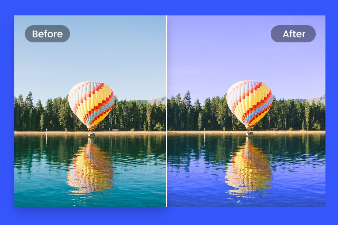
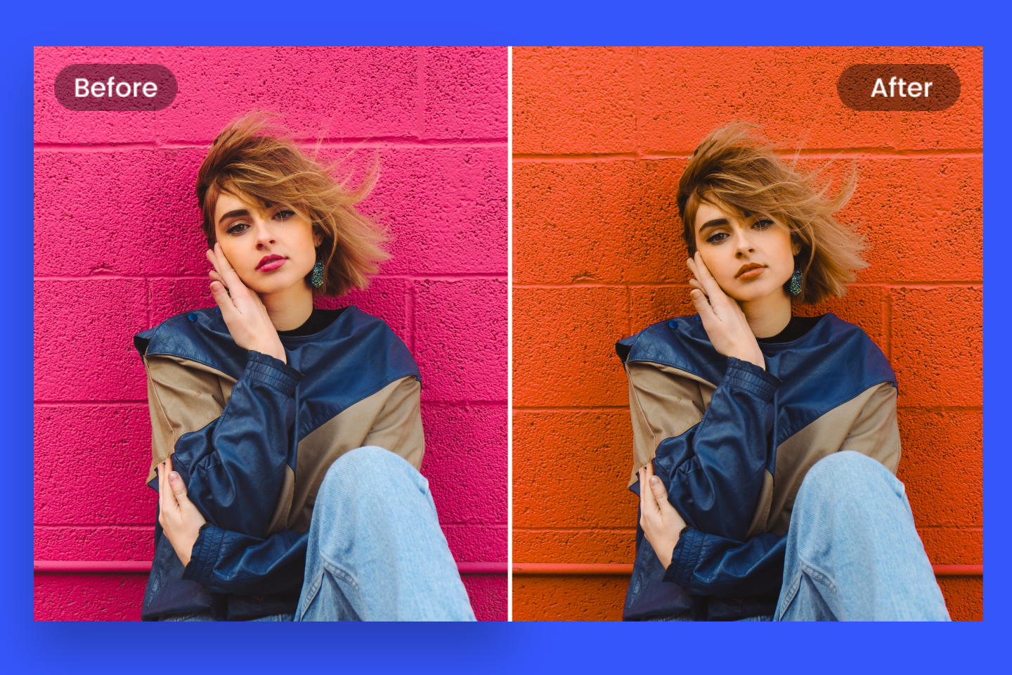
Because they reflect a perceived temperature, colors are grouped together as warm and cool. For example, you can use a cool color background such as Blue with a warm colored object such as Orange and make the Orange object appear closer and more intense. The example below demonstrates this in a dramatic way.

Analogous Colors
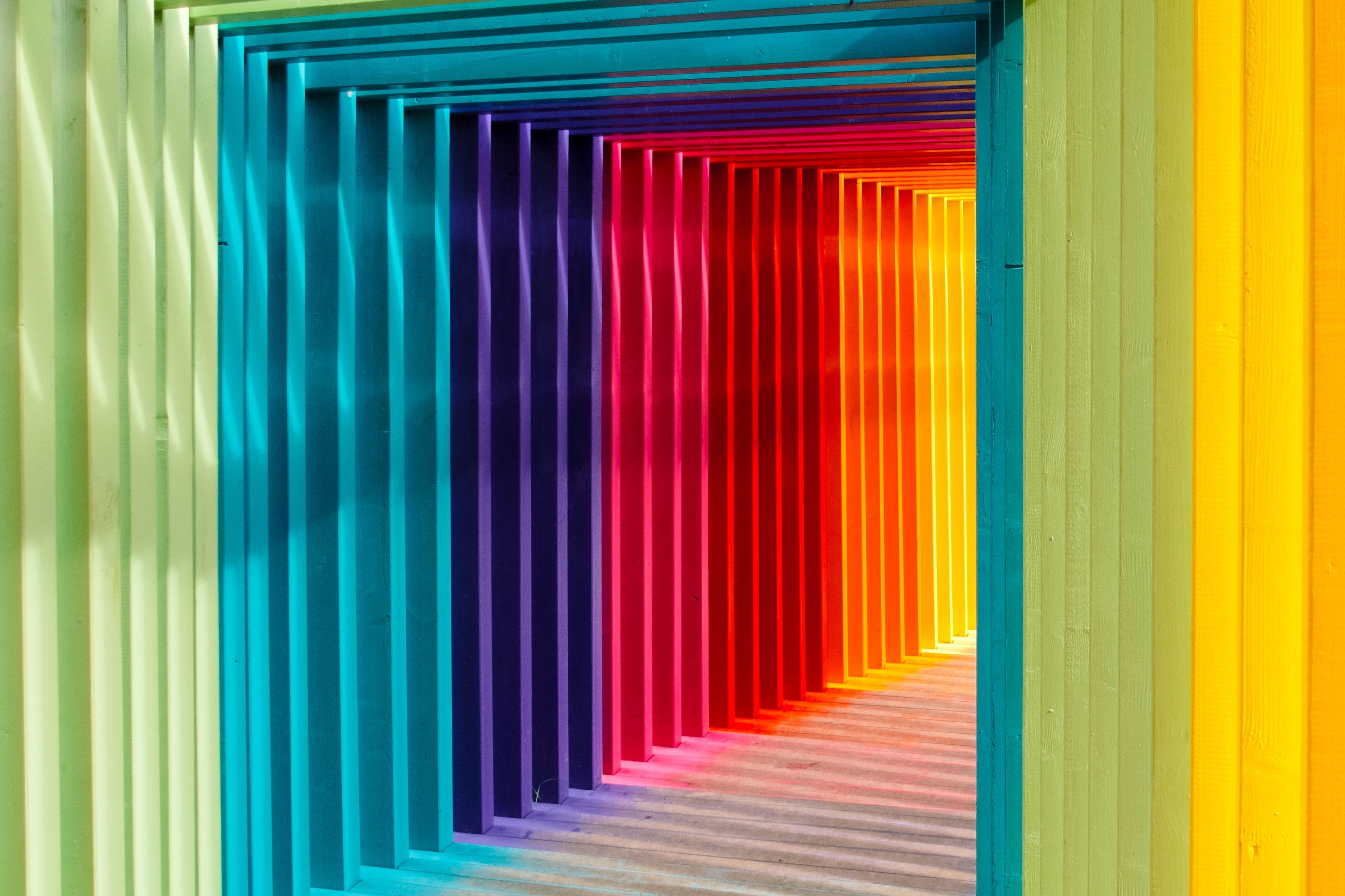
Another way to use color is to use an Analogous Color Scheme. This approach uses three colors close to each other on the Color Wheel. You often see this in Nature.

One More Thing about Color Theory
If you are going to talk about color and work with it effectively, you should understand some basic color terms. People often use these terms incorrectly. Here is a brief description:
Hue – Pure color that is either a Primary Color or a color mixed from two or more Primary Colors
Tint – a Hue mixed with White
Tone – a Hue mixed with Gray
Shade – a Hue mixed with Black
Colors are also categorized as bright or intense, pastel, metallic, iridescent, fluorescent, and neutral. Using a color from any of these categories, however, does not change the rules for achieving Color Harmony.
Putting it All Together
Now that you have some idea of how to achieve Color Harmony, you can use that knowledge as a starting point for using today’s color schemes. Keep in mind, however, that a trending color may not be able to a good fit with your brand. If the 2018 color conflicts with other colors in your marketing, find another color that compliments the other colors in your brand. You also need to understand the psychology of color.
Some colors, such as Red, convey energy and excitement, but can also communicate earthiness and stability if grayed down with a cooler color. Like Red, Blue can be dramatic, but in a calmer way. Blue often used communicates a stable corporate structure.
Check out current color trends and see how they fit with your brand. If you use 2018 colors, be sure to apply the principles of Color Harmony to make sure you achieve a cohesive and powerful impact.